Most therapy websites don’t fall short because the therapist isn’t skilled or caring. They fall short because the website isn’t doing the quiet work it needs to do—orienting visitors, building trust, and making the next step feel easy.
Here are the most common therapy website design mistakes I see, and what actually helps.
Trying to Say Everything at Once
Many therapy websites overwhelm visitors in the first few seconds. Multiple services, long paragraphs, and too many options all compete for attention.
When someone is looking for a therapist, they’re often already feeling emotionally overloaded. A crowded homepage can make it harder for them to stay.
A better approach is starting with clarity, not completeness. Your homepage only needs to clearly communicate who you help, what kind of support you offer, and how to get in touch. Everything else can live deeper in the site.
Using Vague or Abstract Language
Phrases like “holding space” or “supporting your journey” may sound comforting, but they don’t help someone understand whether you’re the right therapist for them.
If visitors can’t tell what you actually help with, they’ll move on.
Clear, human language builds trust. Being specific about the people you work with, the issues you treat, and what clients can expect makes it easier for someone to say yes to reaching out.
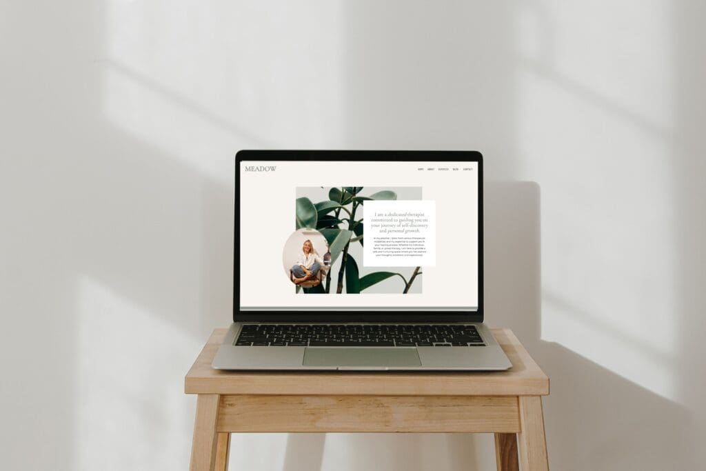
Designing for Aesthetics Instead of Trust
A beautiful website is helpful, but beauty alone doesn’t create safety.
I often see therapy sites that look stylish but feel impersonal, or calm but strangely empty. Design should do more than look good—it should help visitors feel oriented and supported.
Thoughtful spacing, a clear photo of you, and a layout that gently guides the reader all help build trust without feeling pushy.
Overlooking Mobile Experience
Many therapy website visitors are on their phones—often late at night or during moments of vulnerability.
If your mobile site feels cramped, hard to read, or confusing to navigate, people may leave before contacting you.
A mobile-friendly site with readable text, simple layouts, and clear buttons makes a real difference in whether someone stays or goes.
Making Contact Feel Complicated
Hidden contact links or unclear next steps can quietly stop someone from reaching out, even when they want to.
When someone decides to contact a therapist, that moment matters.
Making the next step obvious—through a simple contact form, one primary call to action, and clear expectations—reduces friction and increases inquiries.
Treating SEO as an Afterthought
Many therapy websites are thoughtfully designed but invisible on Google.
Without basic SEO structure, your site may never reach people actively searching for support.
Simple, ethical SEO—clear page titles, thoughtful headings, and straightforward service descriptions—helps the right clients find you without feeling salesy.
DIY-ing Past the Point of Clarity
Templates and DIY platforms can be incredibly helpful, but there’s a point where too much tweaking creates confusion instead of confidence.
If you find yourself stuck adjusting fonts and spacing rather than focusing on your practice, it may be time for more support.
Choosing a therapist-specific template or professional design can free up time and mental space while giving your site the clarity it needs.